
NEWCASTLE UNIVERSITY
My Role
As a Student of Human Computer Interaction at Newcastle University,I was introduced to the FoodFob (Money Saving) card at the university cafe. As soon as I picked one of these I was able to spot multiple problems in using it. The below case study is my attempt in solving the same to help improve the overall experience of using a Foodfob.
Research Methods
Focus group, usability testing, contextual enquiry
Discipline
UX design, UI design
Platform
Mobile
Time Frame
Completed in 8 weeks (2024)

Introduction
As a Master’s student in Human-Computer Interaction at Newcastle University, I embarked on a transformative project to redesign and promote “FoodFob,” a campus initiative designed to help students save money on their café purchases by adding an extra 15% to their spending wallets.
This case study outlines my approach to leveraging UX design principles to solve the challenges faced by students using FoodFob, enhance their experience, and ultimately encourage broader adoption of this money-saving tool.
Objectives
Evaluate the existing user experience of the FoodFob service
To understand the painpoints of using the Foodfob from university students
Propose a mobile companion app to increase daily active users and visibility
Strategic Value
By understanding the various pain points of the students in using the Foodfob, the university could improve its overall experience resulting in better visibility and increased number of students who would use the service in order to save money spent across the campus.
Outcomes
Proposing a Mobile Companion App for the FoodFob service
Providing students with a companion mobile app which will allow them to make full use of the FoodFob. The mobile app will allow students to utilise the Foodfob to its full potential, ensuring a smoother experience in using the Fob and also earning rewards on their spends.

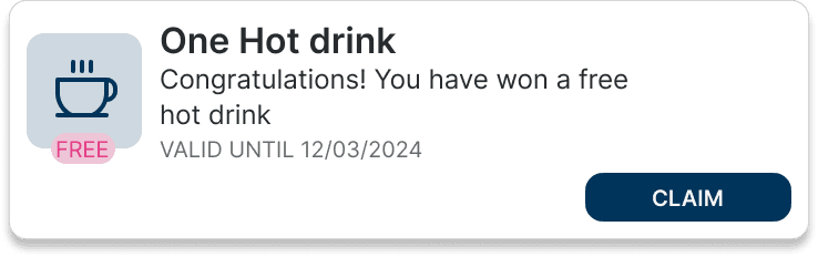
Introducing Rewards to promote engagement and daily active users
Students can accumulate benefits through ongoing utilization of the Foodfob. Their earned rewards increase with each additional Foodfob purchases.


Providing a digital version of the FoodFob card for easier usage and control
By having a digital version of the FoodFob, students will have the flexibility to use their mobile phones to purchase their order at the cafes with the added convenience.

Research
I started to conduct contextual enquiries to understand and validate if the problem was faced in similar manner with other students. The university was conducting focus groups to evaluate the usage of Foodfob among the students of the university, I participated in the focus group as a participant to validate the problems with FoodFob.
Participated in a focus group with other university students to understand and validate the problems that I identified while using the FoodFob card for purchases in the university cafes
Conducted contextual enquiry by observing students who were using the Foodfob in the cafes
Focus Group Insights
“I do not have access to know what's my balance, I cannot track my spending”
"I have to carry the card every time, sometimes I forget to take it along"
"The rewards app is not linked to the Foodfob! , Its different than the other"
The Process
The Approach to this problem was a way to ensure the ease of use by the students and also benefit them by giving them rewards for their purchases. To understand more about Foodfob, I identified the various stakeholders in this process: the baristas at the cafeteria and students who were regular users of Foodfob.
To gauge the usage of the Foodfob by students, I spoke to the staff at the cafe, and I was told the total transactions made using the Foodfob were just 5% per day.
When I spoke to a few students regarding their usage of the Foodfob, to my surprise, only a very few knew about the Foodfob, and they expressed similar concerns as the focus group.
Insights from Discussions:
The visibility of the Foodfob was not sufficient.
Difficulty in using the Foodfob was evident.
I made several purchases throughout the week to map the user journey, and it was evident that the staff did not inquire as to whether I had a Foodfob with me to make the payment unless I explicitly told them that I would be paying with it.
With these insights and mapping, I went ahead and made a few user journeys, as shown below!

User Persona

User journey


User flow and wireframes
UI Design
Once the wireframes were complete, I went ahead and designed a high fidelity version of the proposed mobile app.

High fidelity screens version1
I developed high-fidelity prototypes based on the wireframes:
Home screen: The home screen displays the Foodfob balance and the transaction history.
Rewards screen: Shows the progress of the rewards for the student based on their purchases.
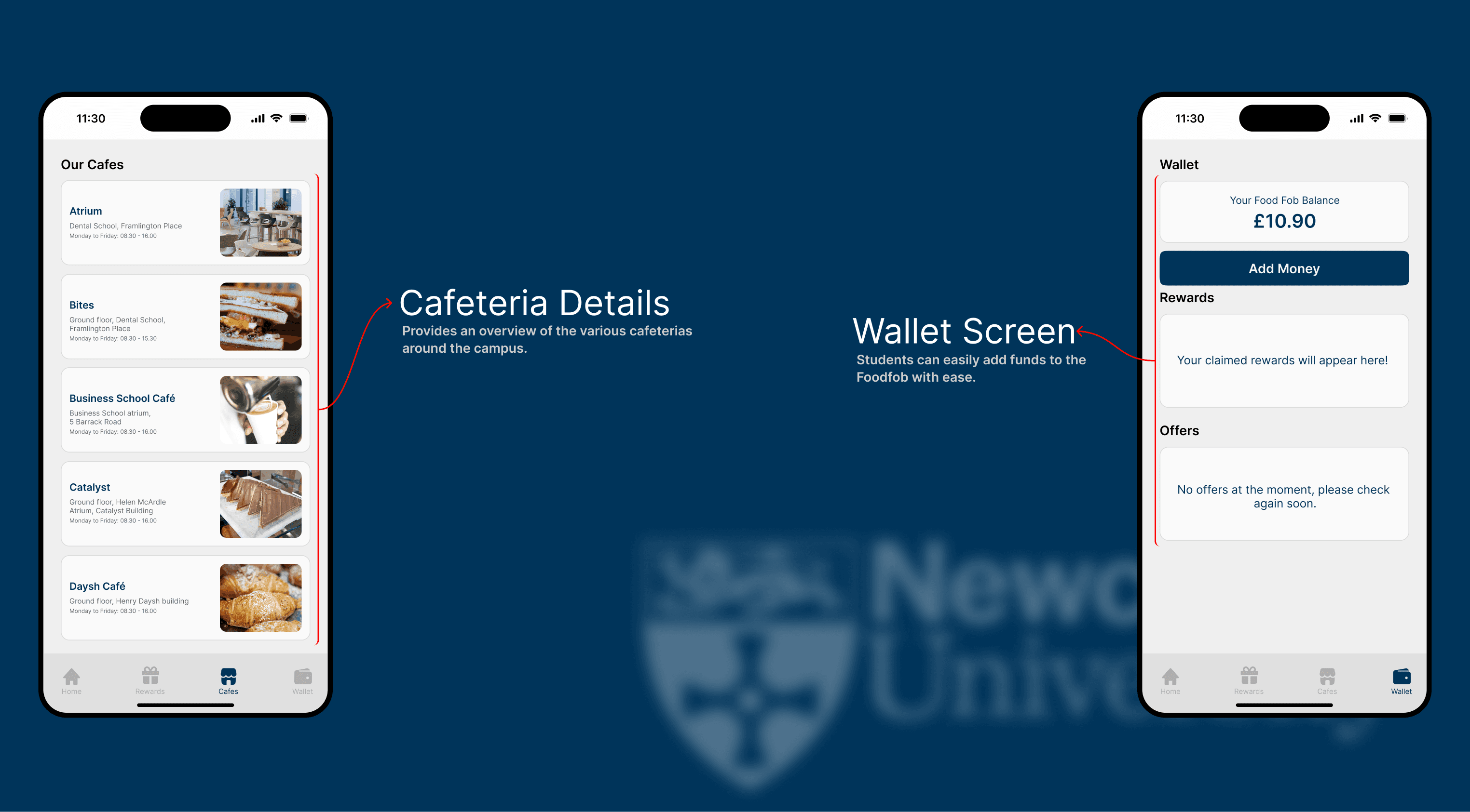
Cafe screen: gives the student a brief overview of the list of cafes on campus where they can use the Foodfob to make any purchases.
Wallet screen: To add funds to the Foodfob and also an overview of available balance, to add funds and know about offers.

High fidelity screens version1
High fidelity screens version1
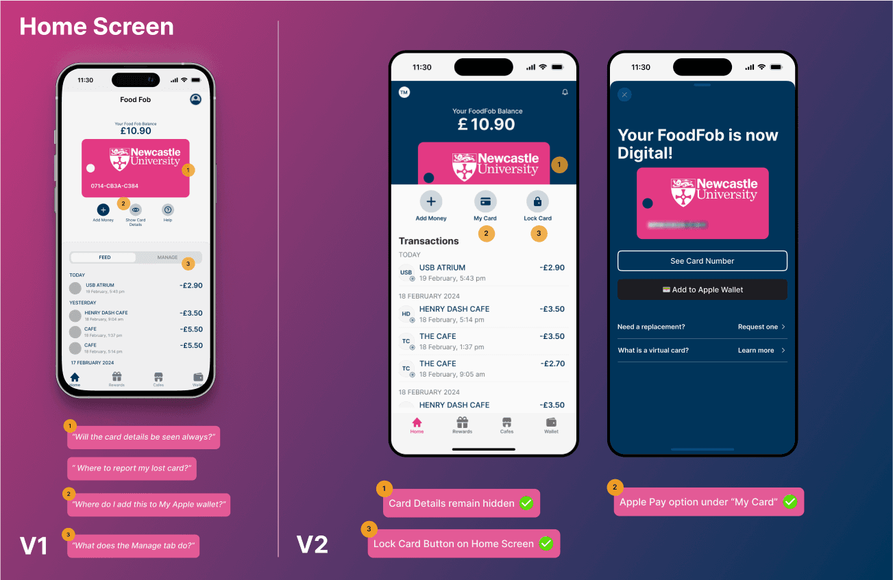
User Testing and Iteration
User Testing:
Once the high-fidelity prototypes were ready, I went ahead and tested these screens with students.Three different students expressed their concerns while using the prototype, which I addressed in the redesign.
Revised UI:
After the user testing, I now had all the user concerns and thought about ways to address them. In the meantime, I constructed a design system using atomic design principles and defined various elements using component properties.

High fidelity screens version1
Revised UI after user testing

Revised UI after user testing

Revised UI after user testing
Future Scope and Learnings
Future Scope:
If this application were to be developed, there would be multiple ways in which it could be used by the University to make the students experience even better by:
Click-and-Collect
Order and pay in advance, then skip the queue with our click-and-collect service.Streamlining campus dining experience and save valuable time between classes.
Exclusive Campaigns
Unlock special discounts and promotions tailored for students. Receive personalized offers based on your dining habits and preferences.
Student purchasing patterns can inform an inventory optimization system, ensuring fresher ingredients and preferred meals stay in stock. promoting a sustainable university community.
Learnings:
01
User-centric design drives adoption
02
Integration enhances user experience
This integration simplified the user experience by eliminating the need to juggle multiple systems or cards. This insight emphasizes the importance of holistic thinking in UX design. Going forward, I'll prioritize creating unified interfaces that bring together related features to improve usability and user satisfaction effectively.
The FoodFob redesign process involved creating low-fidelity prototypes, then high-fidelity designs, followed by user testing and refinement. This iterative approach allowed for continuous improvement based on user feedback, revealing insights we wouldn't have discovered otherwise. The experience reinforced the value of embracing an iterative design process with regular user testing. In future projects, I'll continue to emphasize this approach to ensure the final product is refined and truly user-friendly.


TEJUS R MEDA
MY WORK
FoodFob
College Management Software
LeafLink
CONNECT